Project description
Toad for Oracle is a desktop application for managing Oracle databases. In this project, Product Management was planning a transition from unsupported Freeware to a paid commercial version, but there were concerns about the effectiveness of our existing help resources. With the transitioning user base, we wanted to know if users could find answers on their own and not overwhelm our Support Team. Inside the product, one way to access helpful information is through a text field in the toolbar, internally referred to as “Jump Search”. The Product Owner questioned whether this field matched the intended purpose or possibly required some design improvements. Using a one week research spike, my research described the current user expectations and suggested ideas to encourage self-service help.
To organize the study, I created and regularly updated a wiki page. This provided a way for stakeholders to track progress, look up details about the study, and find the results. The wiki page serves as a record of the completed study and includes links to the corresponding work ticket in JIRA, the prompts, the spreadsheet with the raw data, the detailed results, the Executive Summary, as well as a recording of the share out meeting – – Research study wiki page (send a request to access it).
Research objective
Understand user expectations of the Jump Search field:
- What do they expect the field will help them find?
- What would they enter?
- What kinds of results do they expect to get?
- Which resources do they expect will be searched?
Research method
I recruited 31 product users to complete an unmoderated study.
I used screenshots of the product and asked the participants 6 questions. The study took less than 5 minutes to complete.
High level findings
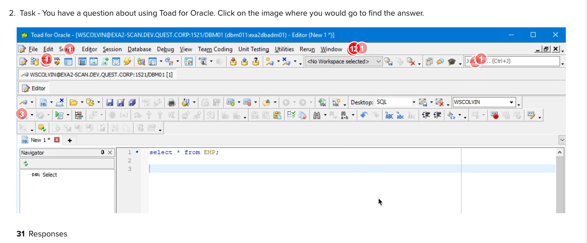
I validated that our users don’t start with the Jump Search to get questions answered, as only 6% of participants clicked on the field in an unbiased task.
When directly asked how they would use the field:
- 29% of participants said they would use it to get help
- 29% of participants didn’t have an answer or had an incorrect perception
When asked to provide a specific text entry example the most popular help use cases were around:
- Navigation: determine where to find a capability
- How-to help: learn about accomplishing a specific task
When asked which resources would be searched:
- More than 70% expected it to search menus and menu items
- Very few expected it to search Google (13%) or the local filesystem (7%)
Participants also wrote comments about: not knowing about the feature, concerns over visual real estate to display it, and how it is is unclear what it does.
Overall recommendations
My recommendations were to:
- Update both the hint text and tooltip so that it’s clear what the feature does. At the time of the study, both simply said “Jump to…”
- Improve the returned results to better support the particular use cases cited: Navigation and How-to help.
- Consider simplifying the design by removing unexpected search results like the local filesystem and Google.
Participants
Screening criteria
- active product users
- preference for freeware over commercial edition users, as they do not have access to technical support
Incentive
I did not offer an incentive to our customers.
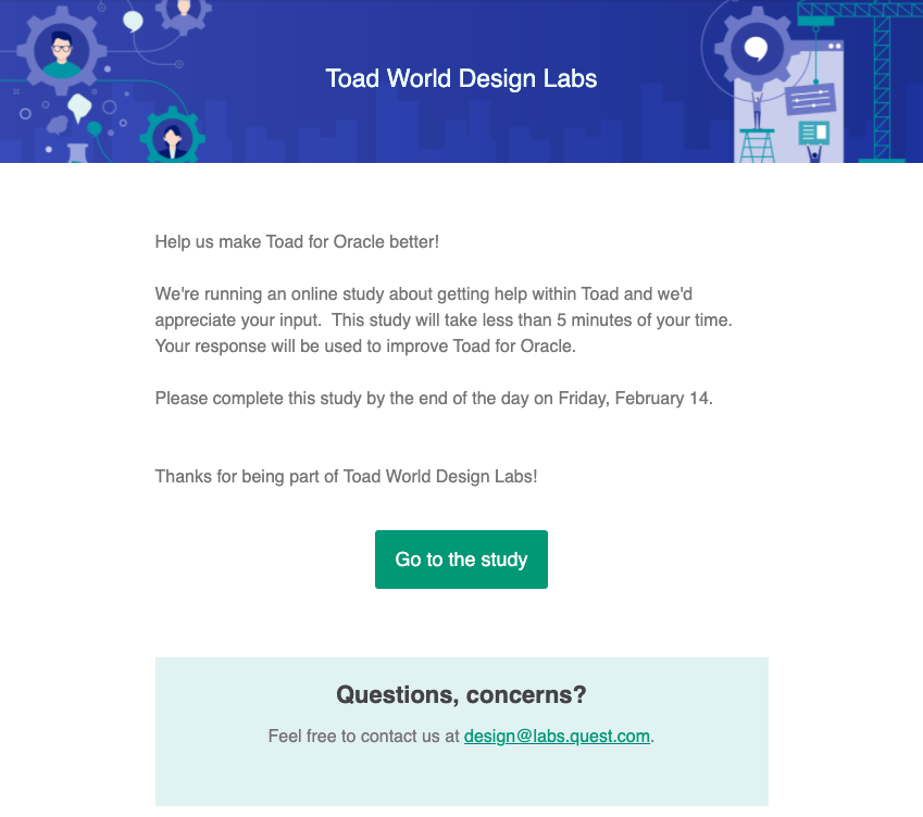
Recruiting email
Unmoderated study prompts
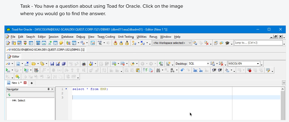
Prompt 1 – Click test to gauge if users see it as a source of help
Prompt 2 – Open-ended question to inquire about uses of the field

Prompt 3 – Open-ended question to gather examples

Prompt 4 – Open-ended question to learn about result expectations

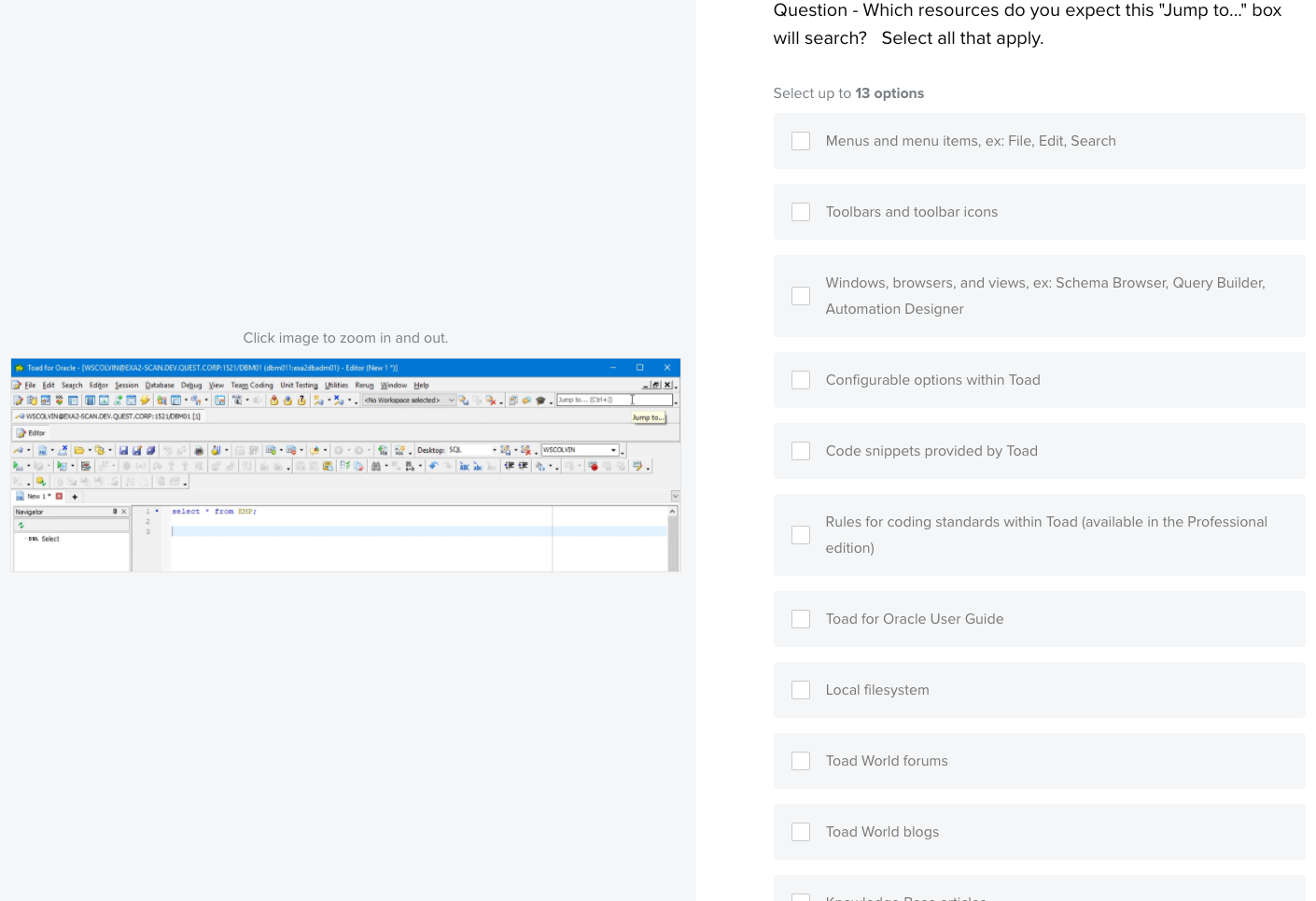
Prompt 5 – Multiple choice question to learn about search expectations
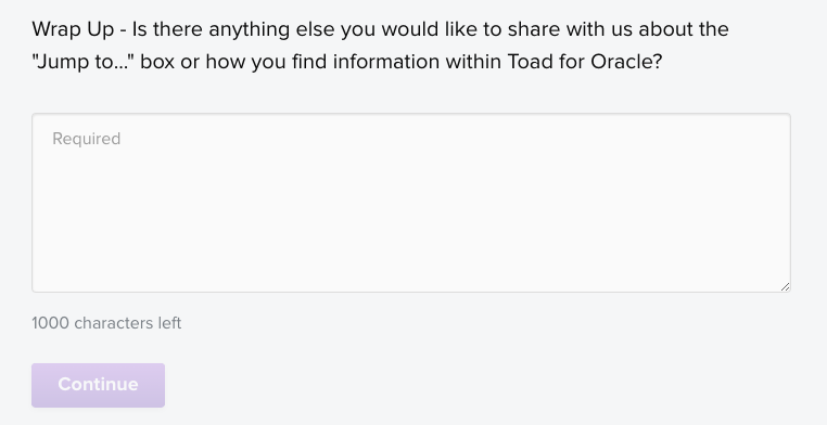
Prompt 6 – Final, open-ended question to gather additional feedback
Analysis process
There were three aspects to the analysis.
For the multiple-choice question, I tallied the responses to understand how many participants chose each option. These results conveyed the resources participants most expected as well as least expected.
I reviewed all of the responses to short answer questions to identify common themes.
I also looked at the resulting heatmap from the click test. Interestingly, only 2 of the 31 (6%) of the participants clicked on the Jump Search field when asked where they would click to get a question answered.
Share out
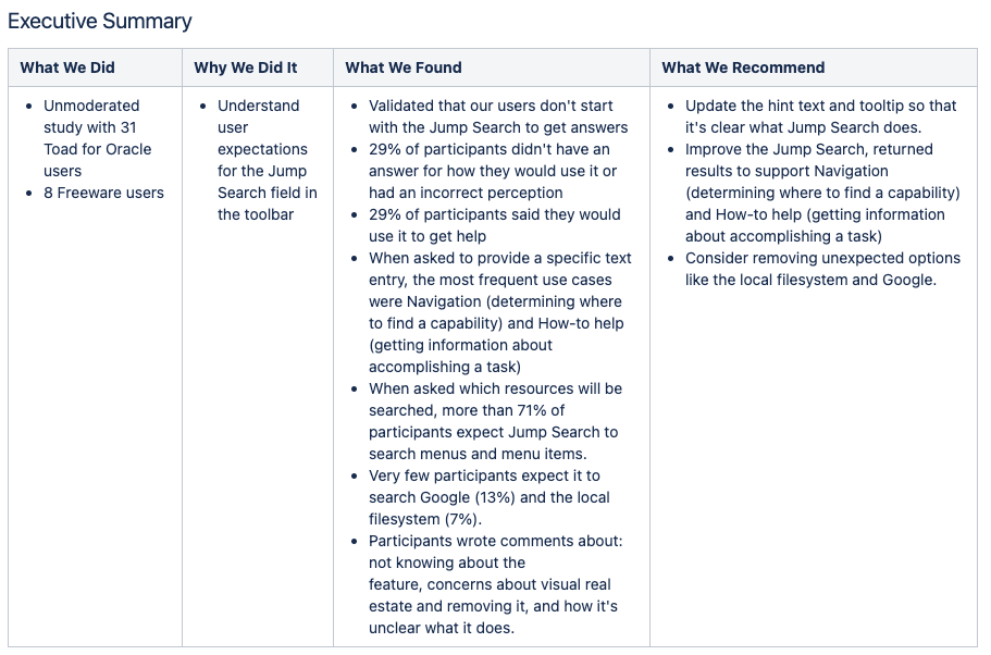
A few days after the study was sent, an Executive Summary was reviewed with the Product Owner and Product Management. The Product Owner was able to immediately act on the findings and recommendation, creating a design ticket to improve the feature.
Impact
After conducting a one week research spike, the Product Owner had the necessary data to prioritize design improvements to this field. We wanted to rely on this field for in-product, self-service support, but the label and search behavior did not afford this.