Project description
Spotlight Cloud is a database performance monitoring web app. The app monitors SQL databases for various metrics and tracks when thresholds are exceeded. In this project, a small, UX design and research team was tasked with designing an email notification feature. Beyond displaying the monitoring results within the app, we wanted users to be notified via email when one or more thresholds were exceeded. Internally, we debated if the initial design and proposed workflow met the users needs, as we questioned the primary use cases. My research quickly evaluated this workflow to guide the design effort. It provided insights about how database administrators use notifications today so that we could design for realistic scenarios.
To organize the study, I created and regularly updated a wiki page. This provided a way for stakeholders to track progress, look up details about the study, and find the results. The wiki page serves as a record of the completed study and includes links to the corresponding work ticket in JIRA, the related studies, the prototype, the moderator script, the session recordings, the analysis, the Executive Summary, as well as a recording of the share out meeting – Research study wiki page (send a request to access it).
Research objective
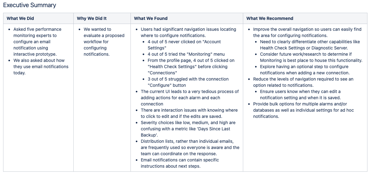
Evaluate a workflow for configuring email notifications. Validate that users can navigate and create an email notification, specifying details and completing the workflow successfully.
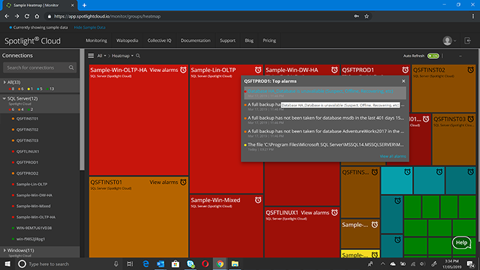
- Looking at the product’s heatmap, can users successfully navigate to the right area for configuring email notifications?
- Can users start to create a new email notification setting?
- Can users successfully specify a connection, an alarm type, and an email recipient?
- Do users have sufficient feedback to know that they have completed the task successfully?
- Do users have any concerns with our UIs or our approach of configuring notifications on individual metrics for a single database?
- What are some of the ways that organizations currently configure database monitoring email notifications, such that these guide our design?
Research method
I ran five 30-minute moderated, remote sessions.
What I tested
I used a clickable prototype that had the main workflow activated and allowed participants to successfully complete the task.
Background questions
I asked open questions about the participant’s involvement with the performance monitoring and how their organization uses email notifications today.
Test introduction
Participants were walked through the basics of a usability test and I told them to “think aloud” as they went through the application. I also told them it was a prototype and that they wouldn’t be able to type and many of the links weren’t clickable.
Workflow Scenario
Participants were give the following scenario
For the database M601\SQLK8, configure the web app to send an email message to backupteam@quest.com when the threshold for “Days Since Last Full Backup” has been exceeded so that the group can respond promptly.
Follow-up questions
After they completed the workflow, I asked participants to give us feedback on our approach of configuring notifications on individual metrics for a particular database.
High level findings and recommendations
Talking with database performance monitoring experts I learned that within organizations, distribution lists, rather an individual email addresses, are frequently used for notifications. They allow everyone on the team to be aware of the situation and support a coordinated response. Our designs were reviewed with this new focus.
I also learned that the email notifications used by organizations often contain specific instructions about next steps, once a threshold is exceeded. Again, our designs were revised to support this level of customization.
Working with the prototype, users had significant navigation issues in locating where to configure notifications. The design needed to differentiate between similar menu headings like Health Check Settings and Diagnostic Server.
- When starting the task, 4 out of 5 participants never clicked on the correct menu, “Account Settings”
- Looking for where to go to start, 4 out of 5 participants tried the “Monitoring” menu. They described how they expected this menu to show the data and configuration options.
- While completing the task, on the Profile page, 4 out of 5 participants clicked on “Health Checking Settings” before clicking on the correct option “Connections”. They expected the settings would allow them to manage which metrics were monitored and the corresponding notifications.
The users also complained that the current UI leads to a very tedious process of adding actions for each individual alarm and each individual connection. Bulk operations were recommended.
I observed that there are interaction issues with knowing where to click to edit and if the edits are saved, as numerous users questioned if their settings were saved.
Lastly, the severity choices of “low”, “medium”, and “high” were confusing to the users, especially with a metric like “Days Since Last Backup”.
Participants
Screening criteria
- database performance monitoring experts
- people not deeply familiar with our web app product
Incentive
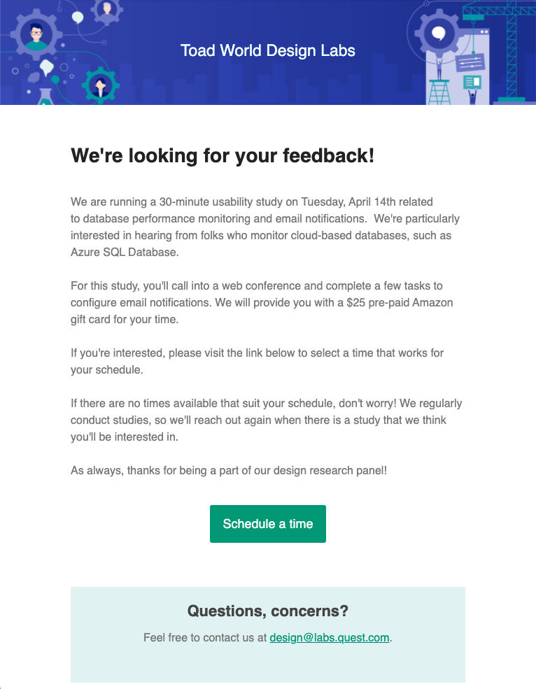
I provided a $25 gift card to an online retailer to thank the participants for their time.
Recruiting email
Stakeholders involvement
The Product Owner prioritized the project and requested regular updates. I invited her and the larger UX team to observe the sessions firsthand and help with taking notes.
We’re running an email notification workflow study.
You’re invited to join us and observe the test.
So we can ensure a smooth and seamless testing process, here are a few details for you if you decide to join us:
· To avoid distracting the participant, please mute yourself immediately and don’t say hello or announce yourself
· Please stay on mute for the duration of the session
· If you have something you’d like the moderator to address, please message them in Slack on the channel #scmm-2329
· If the participant asks a question that you know the answer to but the moderator may not, send the moderator the answer in Slack for them to respond. Otherwise, the moderator will simply take down the question and assure the participant that they will direct their question to the appropriate person and get them the answer later
We’ll be recording these in case you can’t make it.
The meeting details are below.
Data collection
The sessions were recorded and made available company-wide on a wiki page. All of the stakeholders, including product management, technical writing, and engineering, were encouraged to review the recordings.
Along with the recordings, the wiki page tracked the date and time of the session, provided details about the participant, including their first name, company, and job title, and linked to the observers’ notes – Participants and Raw data wiki page (send a request to access it).
Analysis process
A remote, collaborative analysis session was held using an online whiteboard tool, Mural. All of the observers were invited to add their notes and reflections. The whiteboard tool was organized based on research questions and participants.

Share out
A week after the sessions, an Executive Summary was reviewed with the Product Owner. This provided an official, 30-minute update on the project, although the UX designer was already working on the next iteration of the designs.
Impact
The impact of this research work was two-fold. It uncovered usability problems with the current design and provided realistic scenarios for database administrator notifications. The navigation was revised to avoid similar menu headings. We regrouped on the tedious interactions and we improved the design so that saving settings was intuitive and straightforward.
Our designs were also updated based on the newfound information about how database administrators manage their work and collaborate together. Internally, we used these new use cases to evaluate our next iterations.